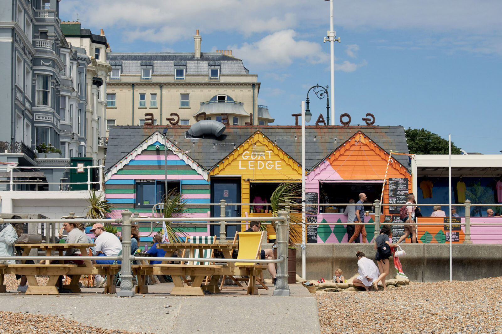
St Leonard's, East Sussex, had a massive transformation over the last few years with an explosion in creativity, new businesses and an influx of money with people moving down from London to embrace life on the coast.
A new market was emerging and Seaside Romeo wanted to appeal to this new demographic.
As an emerging creative agency based in St Leonard's they were looking for a brand identity that embraced the nostalgia of British seaside culture.
Think deckchairs, sticks of rock, seagulls and fish & chips.
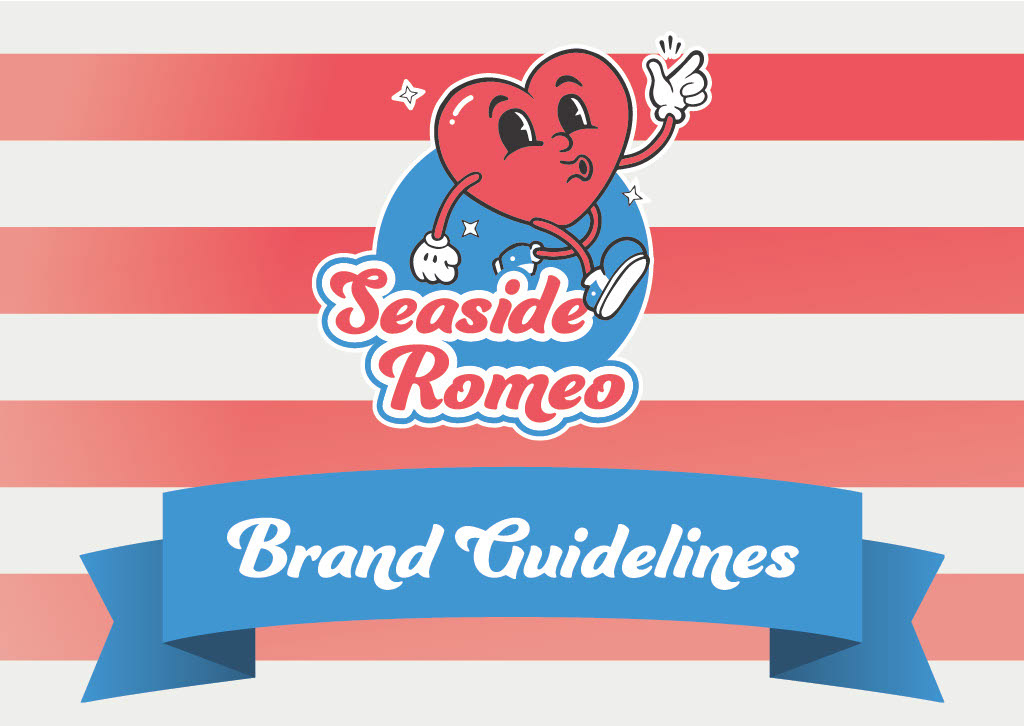
I was tasked with creating that brand identity, logo suite and the brand guidelines.
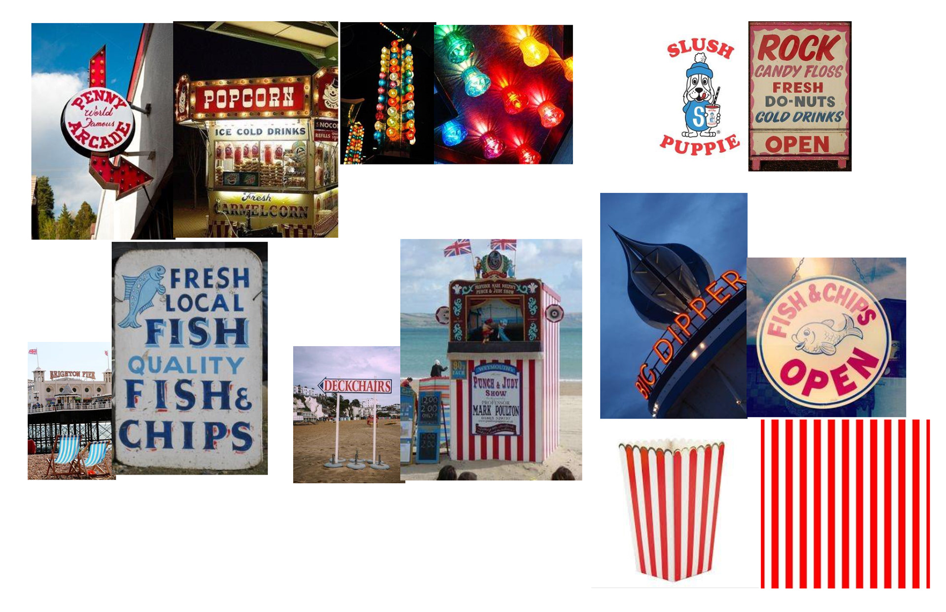
Starting with research, I looked into all the key elements that give the UK seaside culture its charm.
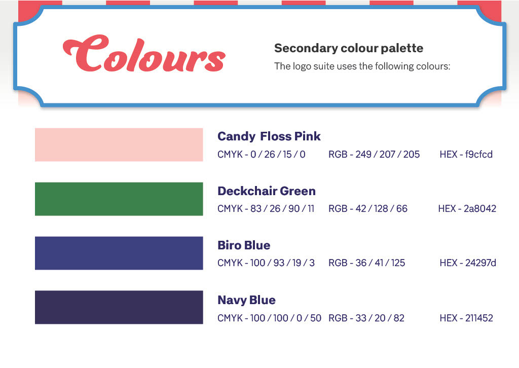
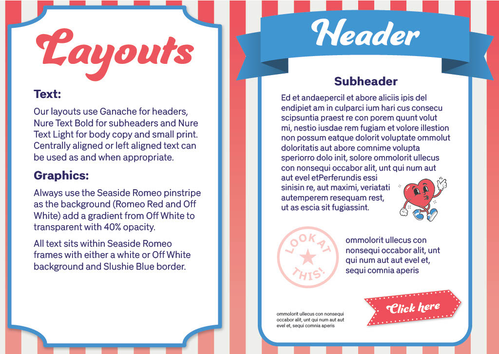
Among the many influences were shop fronts, candy floss, deckchairs, Slush Puppies, parasols and fair grounds. All of these elements helped inform the style of layouts, fonts, colours, buttons and pretty much every other aspect of the look and feel of the brand.
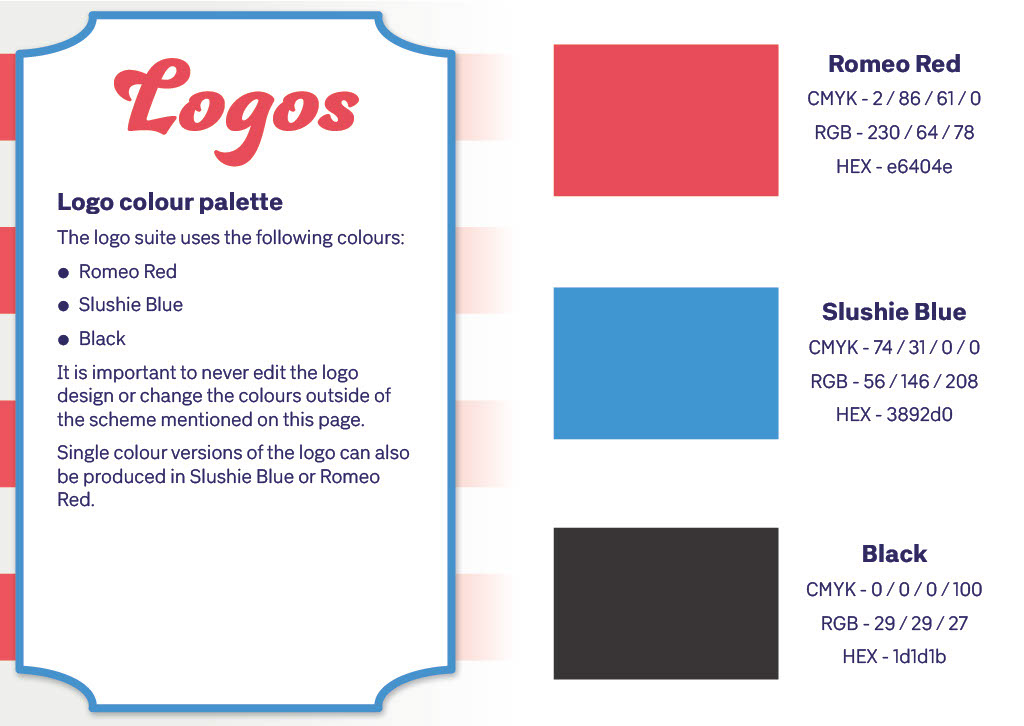
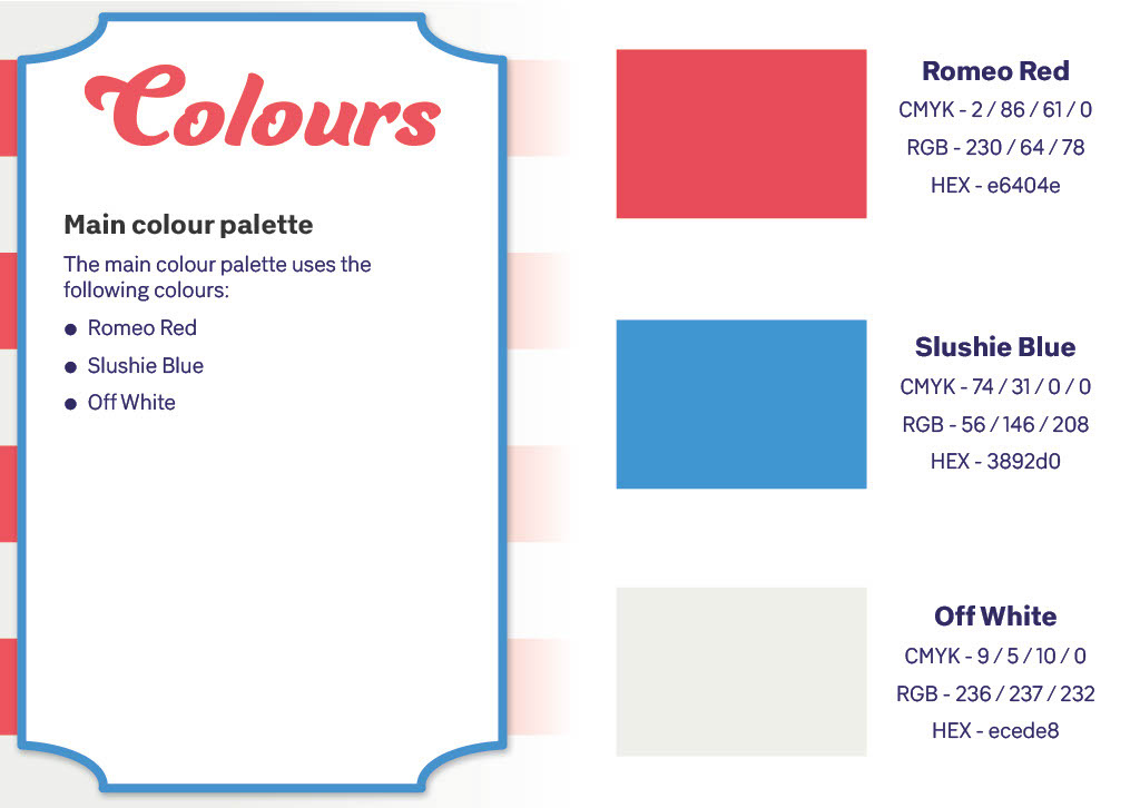
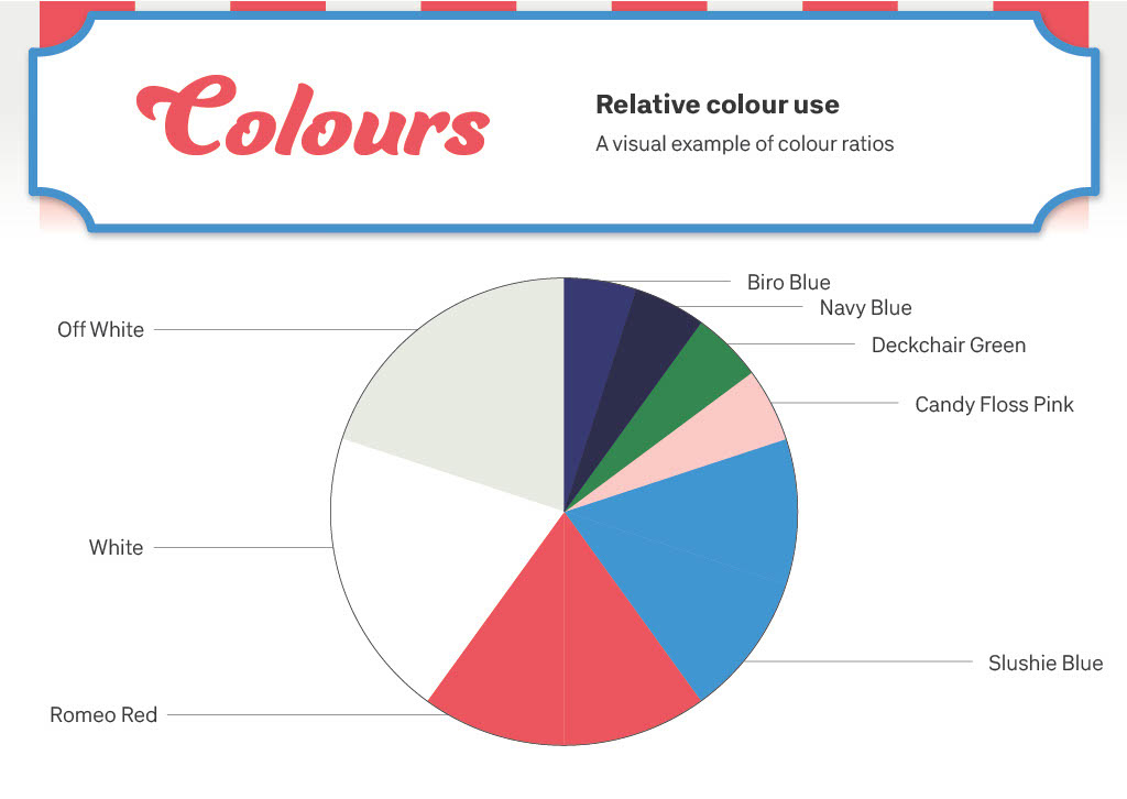
A red, white and blue colour palette was a good fit for the main brand colours (a nod to Slush Puppies) along with a unique mascot that conveyed the cheekiness and confidence of the brand.
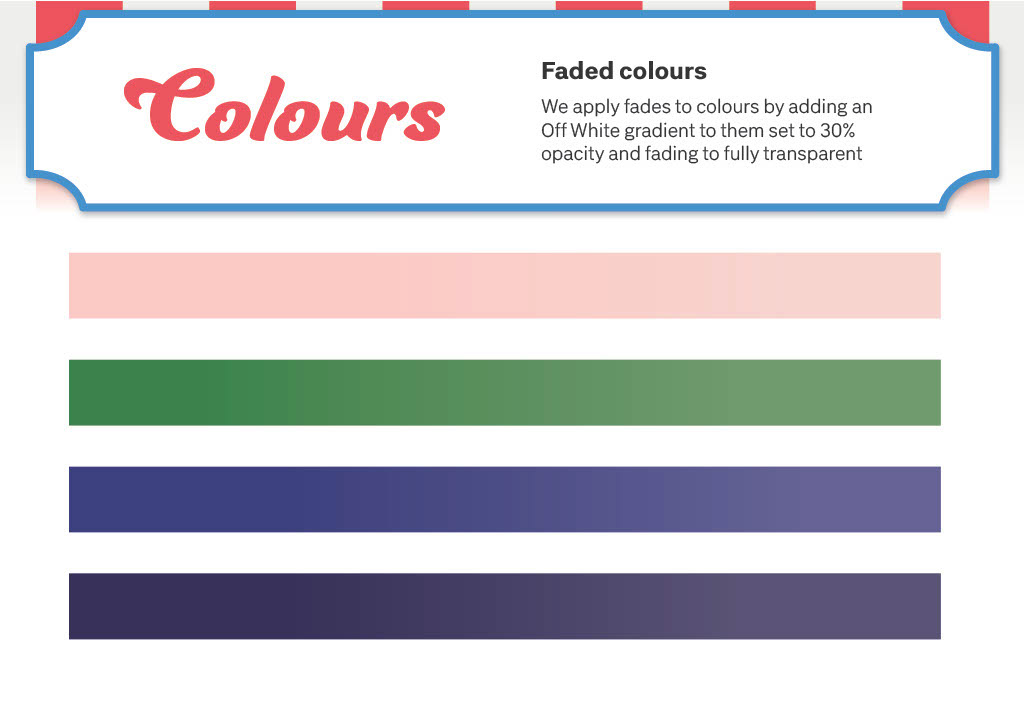
Red with an off-white pin-stripe was a bold feature for use in layouts, referencing the iconic style of deckchairs that are associated with the UK seaside. A sun fade was added to soften the style while adding authenticity.
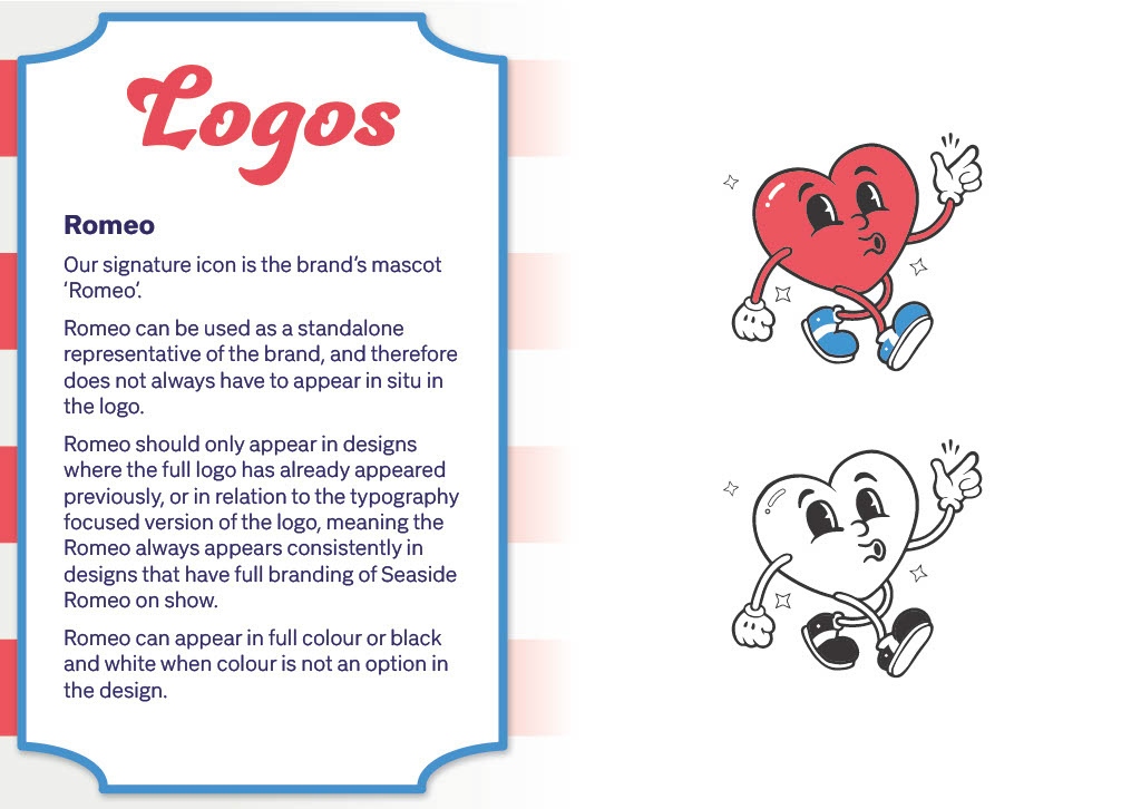
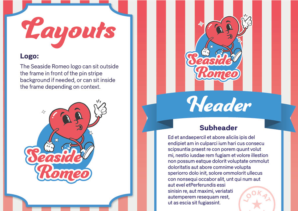
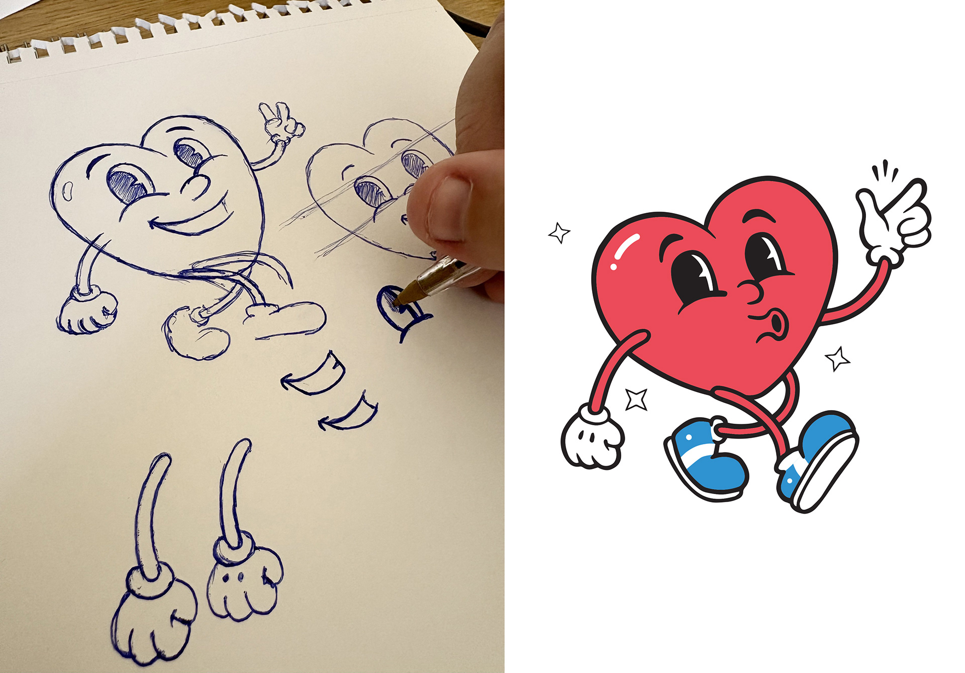
Once the research stage was complete I began working on the mascot. It was important that the character had the right level of cheekiness, confidence, nostalgia.
I began with sketches based on vintage cartoons that I gathered at the research stage, and drew up a number of different poses, positions and details like arms, legs, eyes, hands and feet.
This was the start of a fun stage of creative back and forths with Millie, the founder of Seaside Romeo.
After some brainstorming sessions and going back to the drawing board a few times, we started to pin down what it is we really wanted to see when we look at 'Romeo'.

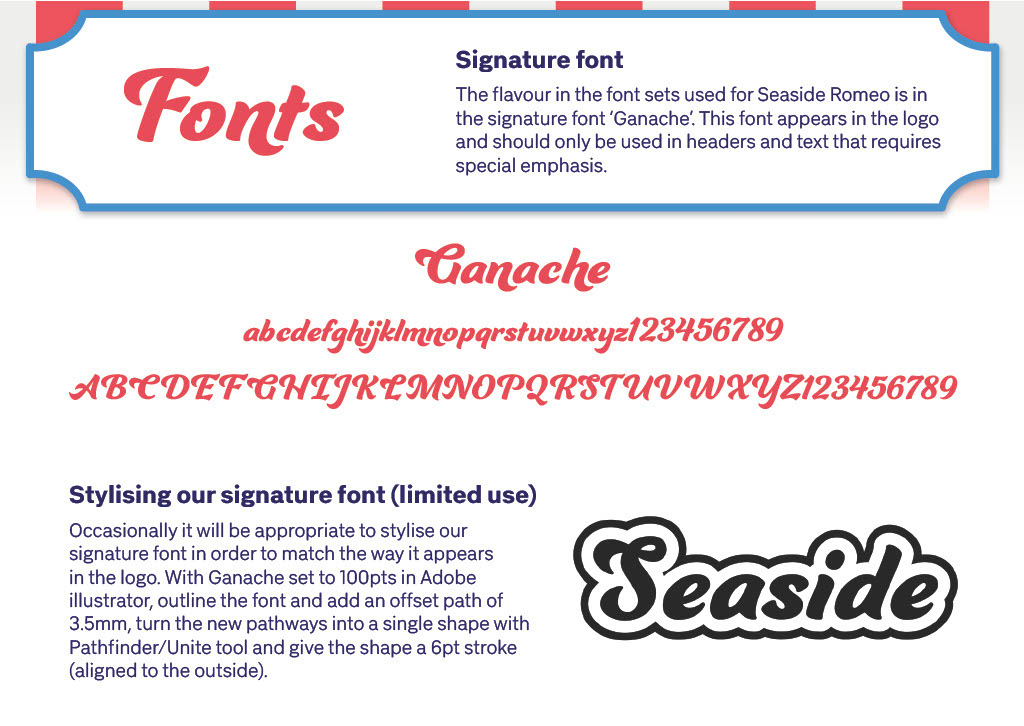
Next up was the equally important discussion around typefaces. We needed to keep that thread of vintage magic running through the brand.
We eventually landed on 'Ganache' a font that brings you back to those trips away, equally at home on an ice cream van or on a beach hut.
I set up a bespoke version for the logo that uses a few unique stylistic elements while also providing guidance when using the font in layouts in its editable form.
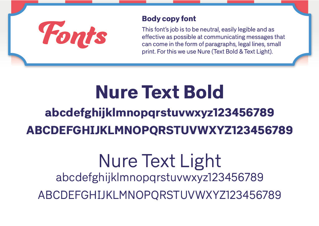
Nure was our neutral, sans-serif font for when you want high levels of readability. Something that can be used for body copy.
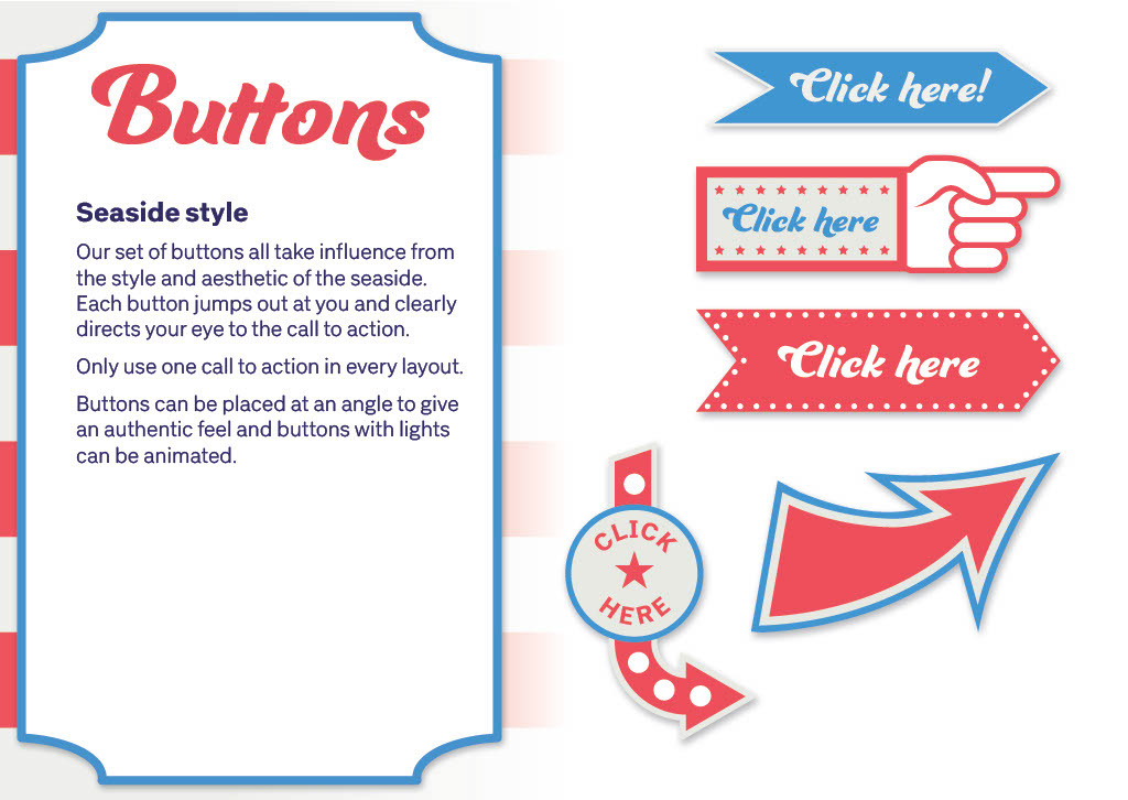
Buttons were a clear call back to the bright lights of the pier, the kind of thing you'd find at a Punch & Judy stand.
As somebody who grew up on the coast I can remember the allure of the fair and the arcades and I wanted to capture some of that charm.
Subtlety was not the priority here, instead we went for big bold buttons that you can't miss.
There was a clear opportunity here to animate the lights on the buttons, and we embraced it by using animated buttons where appropriate.
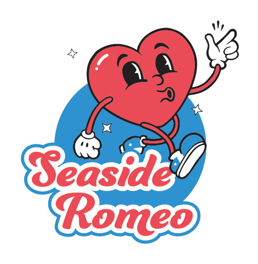
The end result is an eye catching brand that stands out, is memorable and unique.
The association with the UK seaside is immediately clear and has proven to resonate with locals looking to build their business with creative marketing.
The business launched in 2025 and has been off to a great start with an impressive client list, and for those clients looking for brand design work there has been a consistent request to use whoever is behind the Seaside Romeo branding for their own projects.
Very positive feedback and a sign that the brand style has struck a chord with the locals.