When the Covid pandemic happened I was presented with the challenge of creating a cohesive and clear style for messages pertaining to the rapidly changing advice for customers travelling on the GWR network. There was a lot of anxiety among the travelling public, and the public in general. The unprecedented disruption the pandemic caused to everyday life and the evolving advice around safety and hygiene meant it was a top priority to make sure people had access to very clear, up to date advice that met the standards set by the government, which at times was changing every week.
The first step was to look at the pre-existing creatives for various types of messages across the business, consider the rationale behind each design and see if there are any insights we can gather that will help to inform the style for Project Phoenix.
Customers on the network were already familiar with our Policy creative, a very simple style for communicating messages such as "no surfboards on trains" or "no e-scooters allowed" but this creative style also extended to travel advice such as "stay hydrated when you travel" and advice around luggage (the distinction being that some messages were prohibitive in nature while others were advice on what to do). The design consisted of a roundel icon on a white background with clear messaging above (header Glypha 55 Roman/Standard, body copy Univers 45 Light) in black.
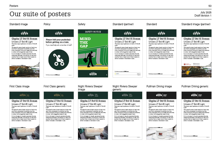
Below is an example of the GWR suite of station posters, which shows the Policy template in context.
This clean, clear messaging was already well established and familiar for those travelling on the GWR network, and with the nature of Project Phoenix advice being both positive messages (actions we ask the public to take) and negative messages (actions we do not allow), something already covered by Policy messages, it felt the Policy creative was a good foundation upon which to build on.
I created a set of icons that met the criteria needed for Project Phoenix, using accent green as the signature colour, removing the roundel element to make it distinct from the Policy creative while close enough in style to be coherent when seen in context with other designs.


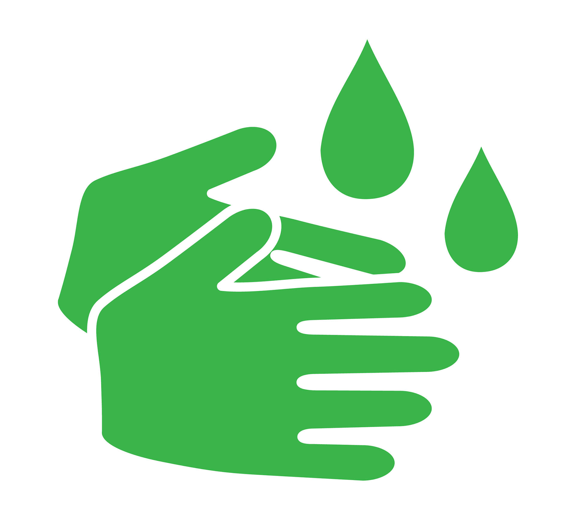
The simplicity of the design allowed for very effective, clear messaging while at the same time being easy to update quickly (a vital feature as there were 20 or more edits and updates needed a day at times and when advice changed everything needed to be updated across all channels within a day or two).

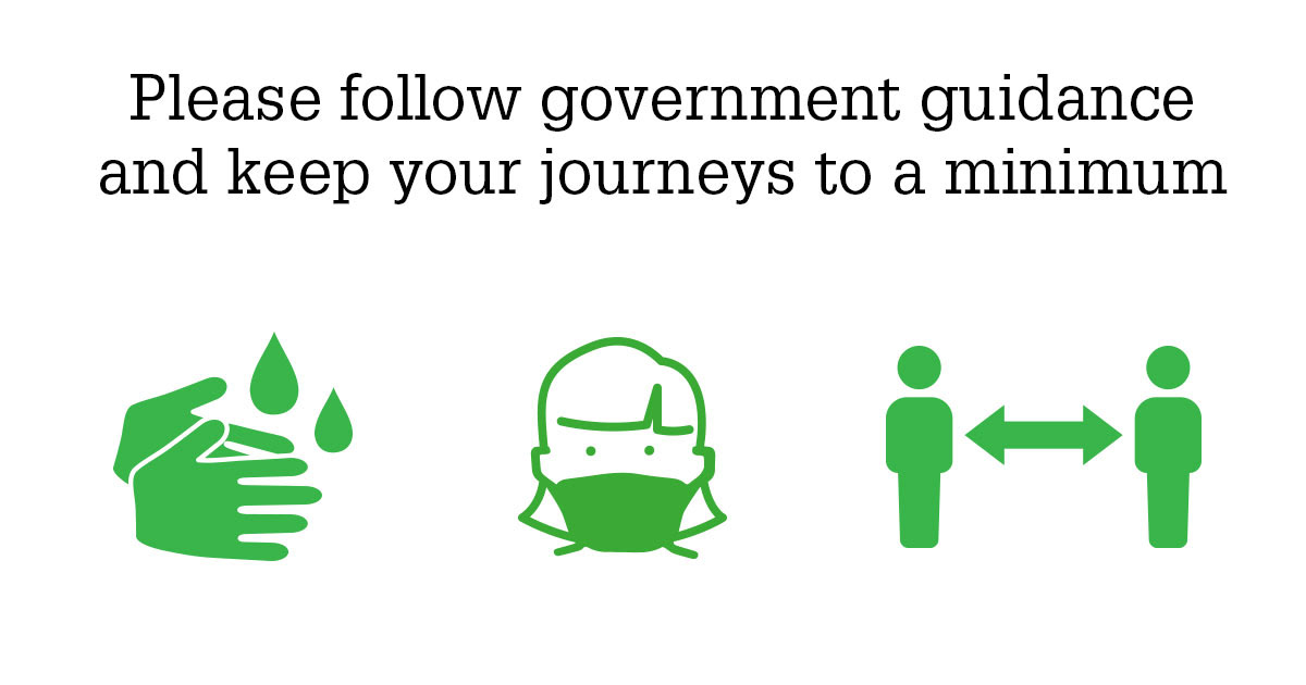
Extrapolating from this starting point we were able to use this creative across multiple channels and maintain consistency across all Project Phoenix messages. The final creative was adapted as motion graphics, digital assets, door stickers, entrance/exit signs, booklets, hi-vis vests, stickers, posters, on-train signage, ticket paddles and window vinyls.
Bringing the messages to life with animated visuals that helped drive home messages through story telling proved to be one of the most effective channels for giving the public the information they needed.
Posters, on-board messaging, online banners and social posts maintained this style across the company's communication channels and helped establish a visual language through consistency, and the accent green signature colour helped make Project Phoenix messages immediately identifiable and recognisable.
The end result was a campaign of recognisable designs that effectively informed customers of travel advice during the pandemic. The easily editable templates gave us the agility to respond reflexively to rapidly changing government advice and keep all messages accurate and up to date in a format that felt familiar for those used to travelling on the GWR network.
On a personal note I remember, like everyone else, being struck by the sudden lifestyle change during lockdown. This project became my main focus and the daily structure the project gave me did a great deal for my mental health during the time. Being inside my flat in London for such a long time, I remember one day when restrictions were lifted seeing the Project Phoenix designs I had created all over the network across the country and it made me realise the contribution I had made while feeling quite disconnected from the outside world. For that reason, I'm grateful to have been able to work on this project.