The re-brand of GWR happened in 2015 and established a heritage style that brought Isambard Kingdom Brunel's original vision back to life. The new brand identity reconnected the business with its historical legacy, but the implementation of the brand left a lot to be desired, losing some of its charm. Consistency was a real issue and a misunderstanding of how to apply brand styles within the business was not just a brand issue, as it started to veer into compliance and accessibility territory also.
After I joined the business in 2017 I began working everyday with the pre-existing brand guidelines and early on, some very clear problems in the guidance became apparent. For example, colour values would appear the same for different colours in the guides, advice for font use was impractical (Glypha, the signature font, was designated to print only while Univers, our secondary font, was designated for digital use only). It became clear to me that the inconsistent and problematic implementation of the brand guidelines were a direct result of guidance that was either contradictory, impractical or frankly, wrong.
I was eventually given the task of creating a new, improved set of brand guidelines. The mission here was to correct mistakes and above all, raise the level of consistency and that is what I set out to do.
My first action was to correct blatant errors (such as incorrect colour values) and begin booking in meetings with senior members of each department that needed to be included, it was important to get buy-in from all stakeholders and hear them out with regards to what it is they want, what unique considerations may apply to their area when developing designs and to hear about any likes/dislikes they wanted to highlight with regards to what we were already working with, and why?
It's important to emphasise how much of a factor soft-skills play with regards to a project of this magnitude. There were numerous stakeholders across the business with (sometimes conflicting) views on what they'd like to see added or amended in the guides.
Reflecting on the work, the people skills, social awareness and diplomacy probably weighed up against actual design skills with about a 70/30 ratio in favour of the former category.
Pragmatic decisions were made in the interests of consistent outcomes, this meant reducing options. In a business with 6,000 employees, many of whom produce their own posters, newsletters, social posts, letterheads, etc, we needed to take steps to ensure consistent outcomes across the board and one effective action taken was to simplify the guidance, reduce options and give as much clarity as possible on what actions to take.
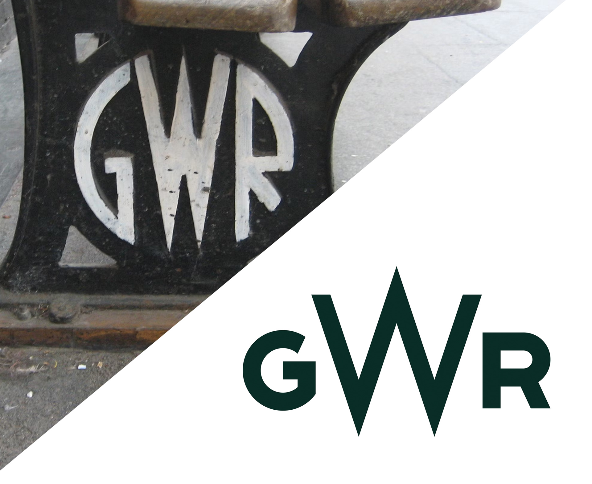
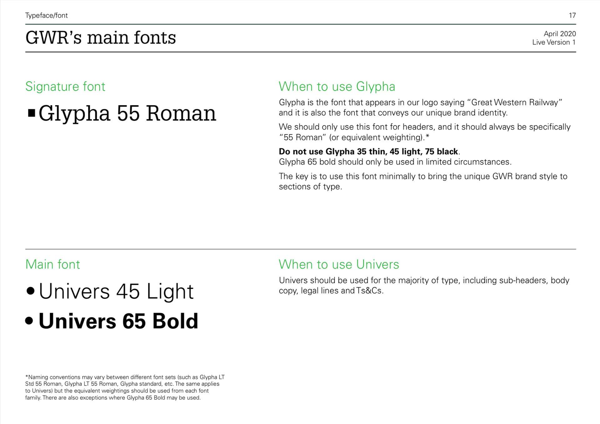
Certain fundamentals were adapted with this in mind and changed the face of the brand dramatically. Glypha (our signature font) was limitied to one weight (Roman/Standard 55) and one use (H1 headers only) with all other copy in Univers Light (and Bold with specific use cases). The logo suite was reduced in size by about 60% (for example, small use logos turning up in designs where a standard logo is needed was becoming a problem, enough so that we removed the option).
Logos for sub-brands were aligned to match the style of the main logo suite and all other logo/identity design requests within the business fell under the newly added categories of either 'GWR Initiatives' or 'GWR Interest Groups' with clear guidance on how this will effect design outcomes (also very helpful with the political side of brand work for groups within the company as they feel they are being treated fairly as opposed to feeling like one group is being favouritised over another).
The updated brand guidelines were published in 2020 and had an immediate impact, no more booklets and e-mails with all the body copy in Glypha, a serif font that causes sever readability issues when mis-used. More importantly, compliance and accessibility standards were met online, on-board and in stations as Univers (our sans-serif font) was put to work in places where Glypha was previously used.
The rate of correct logo use increased significantly, we also successfully minimised variables when printing which meant GWR Corporate Green (the brand's signature colour) now appeared consistent across posters, booklets and leaflet stands. Intuitive layouts within templates helped eradicate anomalies in designs, such as the ever growing gap at the top of pages in booklets caused by previous templates specifying counter-intuitive stylistic choices such as bold sub-headers with lightweight headers and overlines instead of underlines. Once these options are set up to align with people's intuitive choices consistency went up as most people would instinctively choose the header to be bolder than the sub-header in a layout, for example.
A culture of understanding and respect for the brand standards flourished, helped in part by the guidelines being signed off by the Secretary of State. In 2024, System1 analytics found GWR to be 'UK's most consistent brand', a sign that we had some degree of success in the mission to improve brand consistency.